Why Have a Parish Website?
In a recent survey done in the United States, it was discovered that 97% of consumers search for local organizations online and 89% of individuals search for local organizations once a week on their smartphone. If your parish is not online, it is not discoverable. The primary method Millennials (Born between 1981 and 1996) and Generation Z (Born between 1997 and 2015) discover an organization is through friend referrals, blogs, websites, social media, and their favourite online influencers. Four out of five of these methods are found online. Unlike traditional print, websites have the ability to be constantly updated, edited, changed, and much more cost effectively. Your website can promote events and groups, receive donations, evangelize, post bulletins, and provide information, offering an invaluable service to your parishioners.
An Interview with a webmaster on the usage of Catholic Websites. In this video we discuss:
Time: 0:30 – What is the purpose of a parish website?
1:43 – How do you start planning and designing a parish website?
9:09 – What is a consideration parishes sometimes forget when having a website?
12:40 – Where do you learn more about editting websites?
What are the costs of a parish website?
Website costs can vary greatly, depending on the needs of your organization and how you plan to administer your website. There are three cost factors to consider when investing in a website:
- Website platform: the cost of having an editable website using platforms like Squarespace, WordPress, GoDaddy, and Wix can range.
- Hosting: the cost of having your website searchable on search engines can be $12 per year.
- Plugins: more complicated websites involve plugins, which are addition tools/add-ons that allow for easier web design. For example, eeparchy.com has a design plug-in called Divi. However, these are not required to build a website.
Websites themselves are inexpensive overall. The biggest factor to consider for your parish website is the time required for your parish to compile information needed on the site. If you are currently a small or medium size parish in the Eparchy of Edmonton without a website, you can contact our communications office. We will help you get your first website started for free. Contact information is found at the bottom of this article.
What website programs should we use?
The most important consideration in setting up your parish website is to keep it simple. Do not develop websites using overly complicated coding. Instead, use a service that designs websites for you. Programs like WordPress, Wix, and Squarespace greatly assist with the web design process, which anyone can learn. We highly suggest to not use an obscure website building service, as these often come with increased price premiums, less options, and are generally more difficult to use. WordPress is a great place to start when designing your website, particularly if all parishes use it, since clergy and volunteers managing the website will be able to transfer their knowledge of this platform if/when they move to a different parish. On top of that, since WordPress is the most used website building platform, there are thousands of video tutorials and how-to blogs you can search specific to updating a WordPress site.
What the Eparchy uses:
Website builder: WordPress
Website designing: Divi (Elementor is also a great program to help create modern looking websites as well)
What should be on our website?
Less is more on a website. Your website should be a summary of your parish and focused on an invitation to the parish or an invitation to conversation. The biggest mistake parishes can make is focusing on quantity instead of quality. When redesigning eeparchy.com, we went from a whopping 47 pages on our menu to only 16. We hope one day to have under ten pages on our menu bar. While analyzing the metrics of numerous parish websites, we have come up with an optimal parish menu bar that works great for our Ukrainian Catholic parishes within the Eparchy.
Your Menu Bar
The pages that are listed on your menu bar should be pages that rarely or never change. Modern church menu design is meant to have the least number of pages possible, but each page should have lots of information and high-quality content.
Our Parish
This page should include your information on your pastor and a short biography. It should also include any team members your parish has. It should include photos and videos of your parish, Divine Liturgy times, ways to get involved, a list of organizations, your parish mission, and anything specific about your parish.
Bulletins and Calendar
This is almost always the most used page on a parish website. This page is used to keep parishioners updated with a calendar and/or updated weekly bulletins.
Our Faith
All faith articles and faith information should be in one location on your website. If someone is looking for information on faith, they should be able to find this information in one central location under one page of your website and not under numerous different pages.
The Sacraments
This is the page where people click on to learn more about marriage, funerals, baptism, and any other service your parish offers. It should include what the service or sacrament is, the process, and who to contact to get started.
Donate
Have a donate page for parishioners to support your parish.
Contact us
Contact page should include any individual and parish contact information.
Your homepage
You can list things on your homepage that are not found on your menu bar, and we encourage you to do this. For example, www.eeparchy.com does not list the same things on our homepage that we list on our menu bar.
Call to action
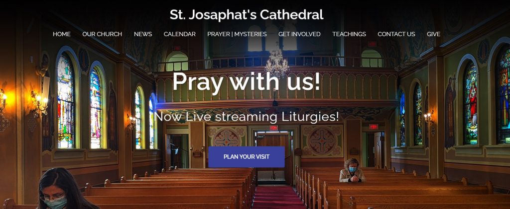
A call-to-action is the first button people see when they land on your website. Your call to action almost always is/should be the most clicked-on button on your entire website. Use this unique opportunity to evangelize, using this prime location to bring those who click there to a page specifically for new parishioners. On St. Josaphat Cathedral’s website, the call to action is “Plan Your Visit.” Clicking this button brings you to a page that welcomes you to the Cathedral, answers commonly asked first-time attendees’ questions, and extends an invitation as well as lists reasons why you should attend the Cathedral. We highly suggest all parishes use their websites as a tool for evangelization.

Blogs/Recent Updates
A very important section on your homepage is a place for the most recent updates. This section is where you post temporary information about events/live streams/updates and anything that is coming up involving parish life. On eeparchy.com, this is our “NEWS” section, which is constantly being updated. Since these new updates are often only temporary, we do not have separate pages or menu bars for the information posted there.
Further Box Menu/Three Boxes
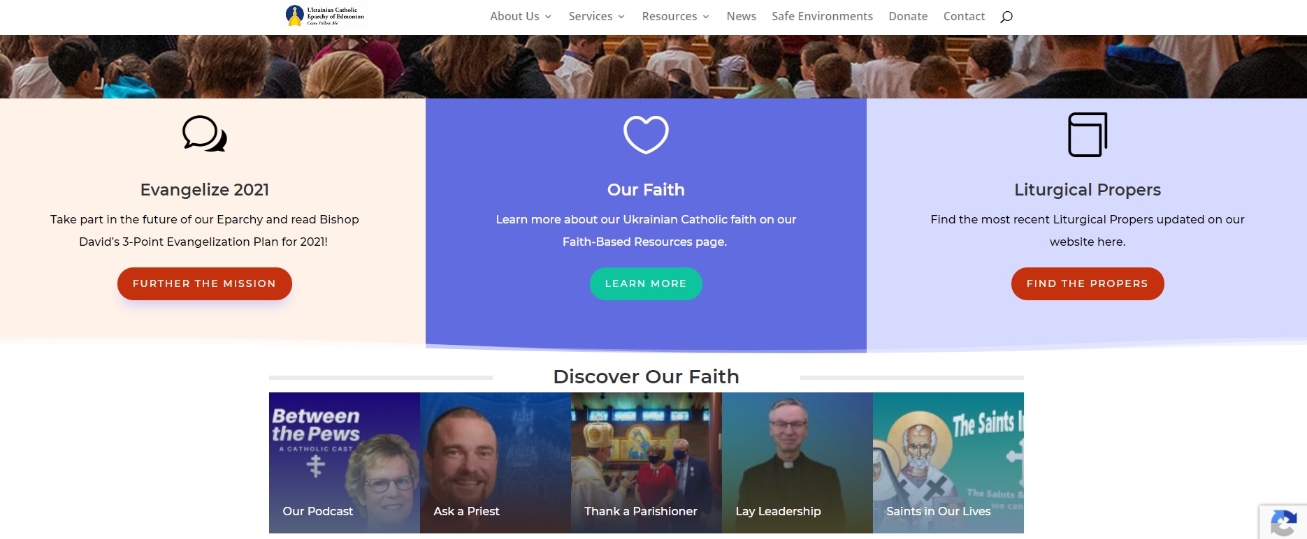
If your parish has more to say that can’t fit in the small menu system, you can possibly use a three-button box system below your website header. This is a great location to have a page for your annual parish campaign, your social mission, a big upcoming event, or any other important information. The Eparchy of Edmonton’s website has a lot of information, so we also include a box menu (below) that outlines our other campaigns such as our podcast, Ask a Priest blog, Bishop’s Thank-you Campaign, our Lay Leadership program, and the Saints in Our Lives videos. Your parish likely may not need this box menu.

Mailing List
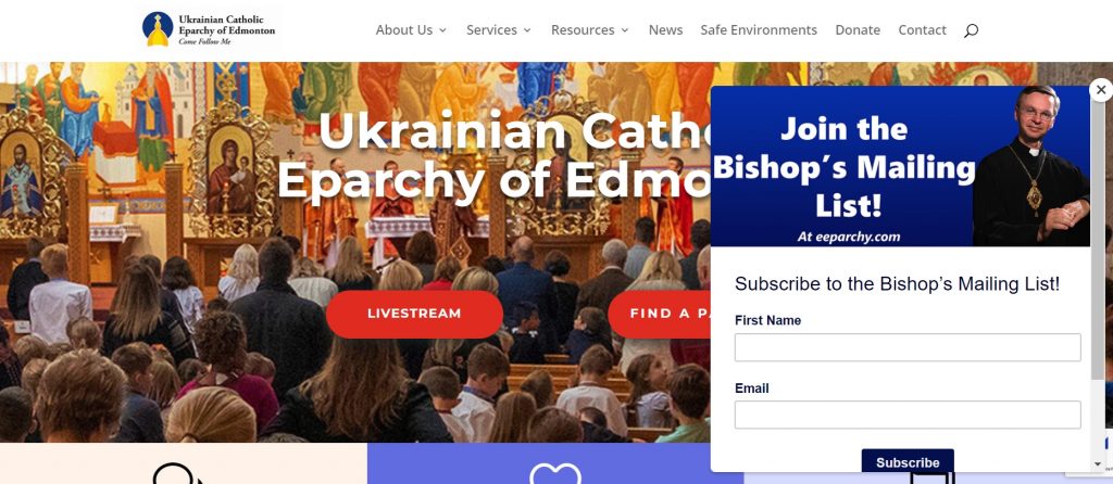
A great thing to have on your website is a mailing list sign-up location. Not everyone visits websites for fun, so having a mailing list is a great way to reach the people who have visited your website only once and to keep in contact with them. For eeparchy.com, we use Mailchimp for our email service – a pop-up appears right before you leave our website. This pop-up provides 90% of our email sign-ups, whereas the signup box that is always on our site provides only 10%. Pop-ups are a great way to get contact information and continue the conversation from your website to their email inbox.

General Website Tips.
Don’t over-do menus: If you have too many menu items, they will often not all appear on mobile devices or on desktop devices. Too many menu items make your website difficult to navigate and will ultimately fail to communicate your ideas.
Remember mobile devices: About 60% of your website audience will be on tablets or mobile devices, so make sure your website looks good on a mobile device and/or tablet, not just a computer. You can do this by simply checking your website with your phone.
Articles versus pages: Think of a website as a house, a webpage as a room, and articles as furniture. If you add another room to your house, the room needs a function. If you’re making a dining room, it needs to have six chairs, a table, and perhaps a few paintings to be a functional room. If your room has one chair in it, the room is weird and useless. The same goes for websites and the webpages within them.
Each webpage has an overall theme. For example, “Our Faith” supports the theme of educating someone in our Ukrainian Catholic faith. On that page, you can have articles pertaining to prayer, baptism, feast days, and so forth. There should be a collection of text, pictures, audio, and video.
Use analytics: When I design websites, I always use a free program called Google Analytics. This program tells me the pages people are clicking on and are presumably reading. If a page hasn’t been viewed in a month, the page is either broken or it isn’t relevant to the website and thus should be either deleted or combined with other pages.
We’re Here to Help: Is your parish currently without a website?
Are you a small or medium-sized parish looking for a website? The Eparchy of Edmonton can help you get your website set-up at no cost! You can work directly with our communications office. Feel free to email communications@eeparchy.com to get started!

