Why traditional print?
Traditional print is a vital part of your communications plan that serves as a great supplement for digital materials. Despite being a more expensive method, it is nevertheless still important to ensure traditional print is used in your communications mix. If you wish to maximize the effectiveness of a message, a mixture of digital, video, in-person, and print will provide a boost in how many people you reach. Simply integrating traditional materials like direct mail to a digital campaign can increase your reach by 62%. Moreover, even the use of print appeal letters continues to outperform their digital counterpart in results.
Design an eye-catching traditional print poster
If you’re making a poster to be posted around your parish property, consider the following factors:
- What is my goal? What is the one objective this poster will achieve?
- What is the printing cost? Ink is expensive, so make sure to not to use too much colour.
- Who is your target audience? A poster for children should look very different than a poster targeting seniors in your parish.
- What is your parish identity? Does your parish have a logo or use set colours? How will you portray that in the poster?
After considering all of this, you can move on to designing an effective poster. Never design posters in Microsoft Word as Microsoft Word is a word processor, not a graphic design program. Instead, use the free website called www.canva.com and search for a pre-made template. Canva will ensure your posters look modern and will help effectively communicate a message. Also note, images found on Google Images are subject to copyright laws. For finding copyright-free photos, use websites like https://unsplash.com/, https://www.pexels.com/, and https://pixabay.com/. Keep these facts in mind when designing a parish poster:
- People follow directions and/or remember information on posters 323% better when that information is accompanied by illustrations.
- 65% of the population are visual learners.
- A minimum of 60% of your poster should be visual-based, not text. This includes information based posters.
- Present any information you can visually, never describe what you can show.
- Colour contrast increases readability. Use light text on a dark background, or dark text on a light background.
- Images are used for the retention of information; text is used for information, so images are almost more important than the text itself. Retention of information is vital in communicating your idea.
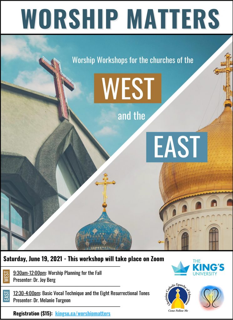
Here is an example of an effective informational poster. This poster uses about 70% high quality images that help aid in portraying the idea and event. In only one sentence, the entire event is summarized. The reader can then decide if they are interested or not. If they are interested in “Worship Workshops for the Churches of the West and the East,” they can read the bottom banner of the poster that outlines the date, time, cost, and location of the event, with further visuals of the organizations taking part. Less than 50 words were used to summarize an event effectively. Keep the outline of this poster in mind based off a top to bottom hierarchy of importance.
- The name of the event should be the largest text and at the top of the poster.
- A one sentence summary of the event should follow in medium sized text to encourage the reader to attend the event.
- The smallest text is the practical information of date, time, location, and costs at the bottom of the poster.
Design Digital Posters That “Stop the Scroll”
If your poster is going to be presented on social media and websites, you have a massively different objective. The objective of digital posters is to only grab your interest, not give out information.
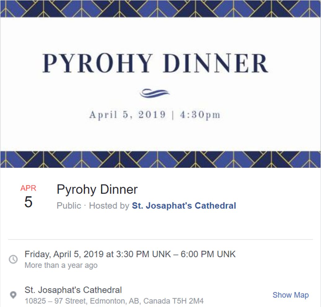
Here’s an example of a Facebook event photo created by St. Josaphat Cathedral. It clearly identifies what the event is in two words. This poster effectively stops readers from scrolling online and they can decide if they would like to learn more about the event by clicking on the Facebook link to learn more. Notice the dark text on a light background that makes readability easy.
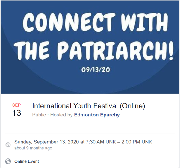
Here’s another example of a digital poster that grabs interest. This poster describes almost nothing about the event specifically, but will immediately grab the interest of any Ukrainian Catholic. They will then read the name of the Facebook event and, if interested in the International Youth Festival, they will click on the event and read further information. Digital posters should never contain more than two sentences. Use the text in the post on either your website or social media to then describe the event. Never include website URL’s in digital posters, only include that in the text of the social media post or website link. You can click on a link in text, but you can’t click on a link on a poster. Notice the light text on a dark background increases readability.
PowerPoint
Traditional uses of PowerPoint presentations are often characterized as slides with giant mounds of text and bullet points. This is not an effective way to portray an idea. When creating a presentation, consider that people retain only 10% of information 3 days after if they’ve only heard it. However, when audio is paired with a photo, retention skyrockets to 65%. The purpose of your presentation should be to educate, and the purpose of your slide show should be to encourage long-term retention. If you want ideas to stick with the audience, use images that resonate. A few ways to effectively use slides:
- Use a picture to support what you’re presenting on.
- Write one sentence on a slide that introduces the concept, question to ponder, or a vital key point of your presentation.
- To really get your message across, supplement PowerPoint presentation with traditional print. As an example, when giving a presentation use your speech to educate ideas, PowerPoint slides to encourage memory retention, and print a one-page summary of the presentation that includes all the vital key takeaways. This will ensure your message will achieve on long-term retention results.
Click here for an older presentation for St. Josaphat Cathedral’s AGM on communications that outlines the balance of text and illustrations built using Canva.com. Although not a one-page summary, click here to view the traditional print that presents text-based findings that supported the ideas shared by audio and Powerpoint. The combination of audio, visual, and print allowed for an effective presentation.
Brochures
Write down one goal your brochure will achieve and then focus all efforts on achieving that goal. If your brochure is a “welcome to your parish,” it should only contain information pertaining someone new to the parish. If your brochure is to encourage sign-ups for an event, the brochure should only be focused on convincing someone to sign-up. Any other information should be left out. After knowing your objective, know how your brochure folds. If it’s a traditional brochure, it will have 6 sides. This is how you should design the 6 sides:
- The first page objective is to generate an interest to pick up and read the brochure. “Men Find Meaning at This Conference” is a great title that will peak your target audience of men to attend a men’s conference. “Help Support Our Parish for Generations to Come” is a great title for a brochure outlining your parish planned giving policy.
- The following 2 to 5 pages should include text to convince why you should take action. Keep it around 60% text and 40% visuals to support your arguments. Use headings and bullet points to encourage readers to quickly read the brochure. The easier a brochure is to read, the more effective the end message will be communicated.
- The last page is the call-to-action. After convincing the reader of the importance of your message/event, the last page outlines the next step you need to take right now. Phone a person to get started, sign-up using a website, or fill in a form on the back of the brochure.
Pamphlets
Pamphlets are used to support word-of-mouth outreach. Pamphlets are meant to be simple reminders of conversations with individuals. Pamphlets can be as simple as a written note or printing numerous notes on one page. If you’d like to encourage event attendance for a Bible study, print off small pamphlets that invite parishioners to the Bible study that include date, time, location, and a short description. Give this pamphlet out to everyone who attends the event asking them to invite one friend. Personally hand out pamphlets to anyone you think maybe interested in the event. Handing a pamphlet to people personally will provide greater results than simply inserting it into a bulletin that everyone receives.
Parish Business Cards
As a unique take on a traditional business card, consider creating a parish card. These parish cards would focus on welcoming individuals to your parish, especially those who have never attended a Ukrainian Catholic Parish before. It would contain an invitation to your parish, location of the parish, and the name and contact information of your pastor. When you meet individuals who have never attended a Ukrainian Catholic parish before, hand them a welcome card! Costing as low as $20, parish cards are a great way to pair an in-person conversation with welcoming print material that can fit in a wallet.